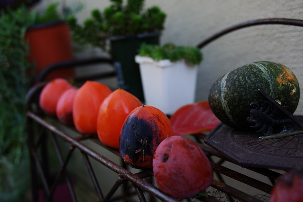
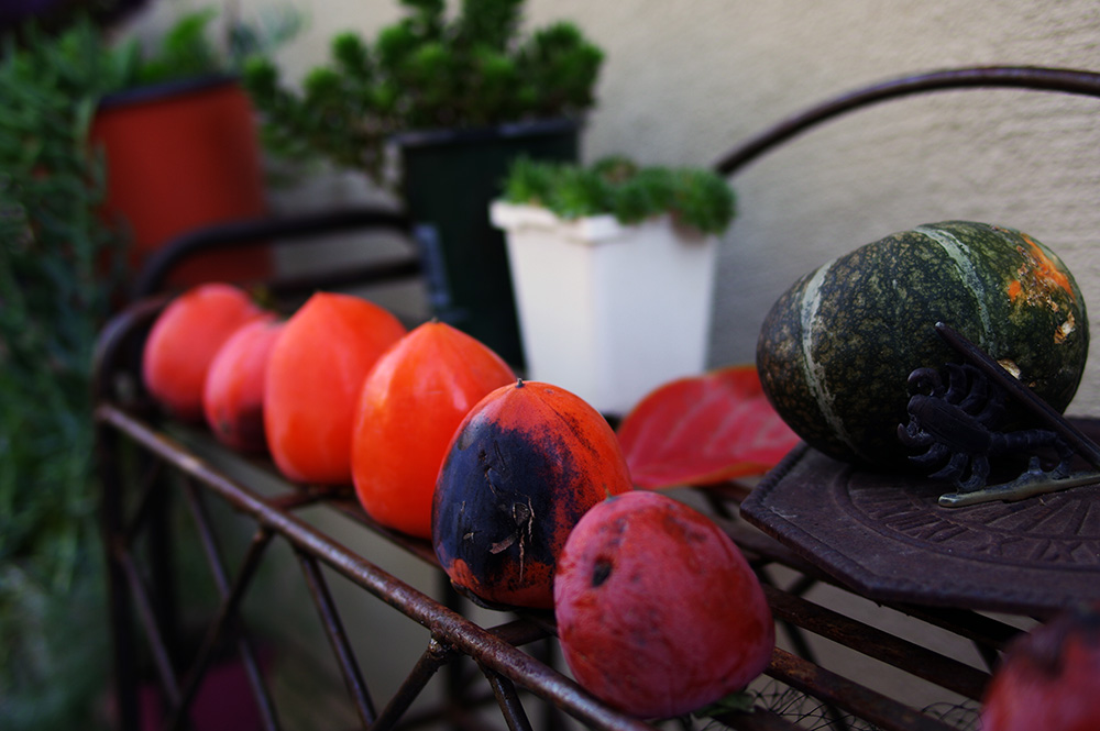
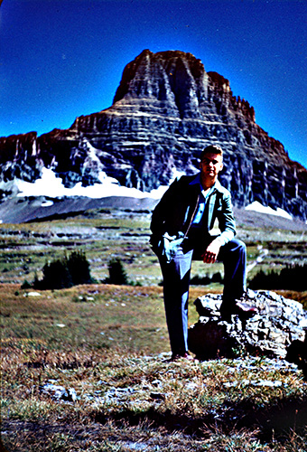
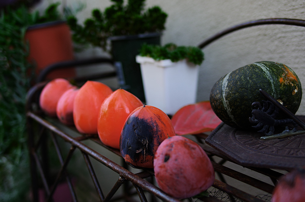
For reference, here is the photo we'll use throughout this post to demonstrate the techniques. I selected it because it has a decently balanced histogram and nice color array. You're welcome to download and manipulate it as you see fit if it helps you to learn Photoshop. The image does not have an open license, but I'm happy to let you use it for learning Photoshop or other photo tools. Here's the link.
10- Auto Contrast
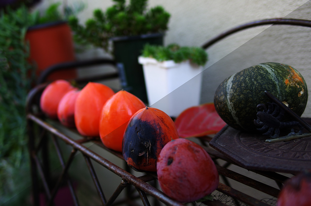
When you push Ctrl+Alt+Shift+L, here is the resulting image:
For comparison, here is the result overlaying the original. The original is in the lower right corner.
This trick evens the histogram through contrast. Basically, if you have a gap between one end of your histogram and either the light-side or dark-side of the spectrum, this features uses the image's contrast to stretch the histogram to fill the space. This trick is good to make colors pop quickly.
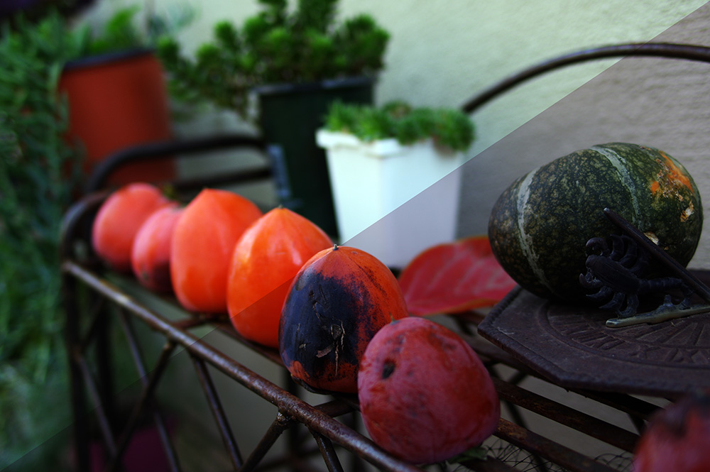
9- Auto Tone
When you push Ctrl+Shift+L, here is the resulting image:
For comparison, here is the result overlaying the original. The original is in the lower right corner.
This trick evens the histogram through color tone. Like auto contrast, this trick closes any gaps between the histogram and the full tonal range by changing the colors' tonality to fill the gaps. That's why the auto-toned image looks like it was taken under fluorescent lights -- green. The original image is red-heavy, so the auto tone function adds green to the light areas for balance. This is much less useful than auto contrast because it is less predictable.
8- Auto Color
When you push Ctrl+Shift+B, here is the resulting image:
For comparison, here is the result overlaying the original. The original is in the lower right corner.
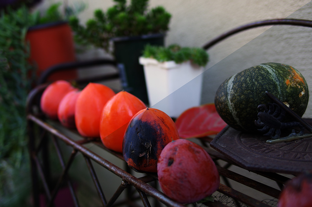
This trick evens the histogram through color hue. Like auto contrast, this trick closes any gaps between the histogram and the full tonal range by changing the colors' hue to fill the gaps. This is a good technique to keep contrast levels basically the same, tone basically the same, and still make colors pop. However, sometimes, this can change color in unexpected or unrealistic ways (check out the traffic-cone-orange persimmons up there.)
7- Curves
Go to menu item Images> Adjustments> Curves.
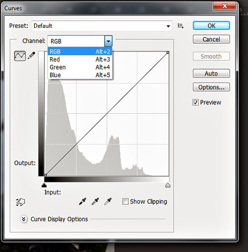
Curves are Photoshop's most powerful color-altering feature. Curves allow you to adjust the histogram all color channels at once or separately. If the automatic functions above fail to give you to results you want, using cures you can still achieve the desired results. Here are the results for adjusting this image in each channel (separately without combined effects.) After the images, I'll discuss what's happened.
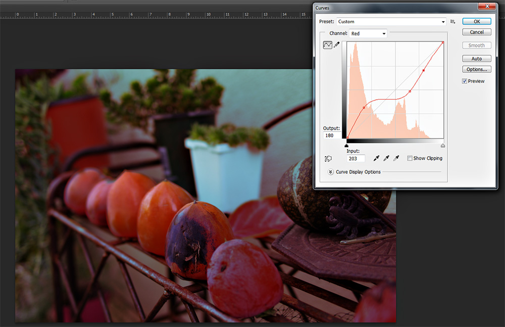
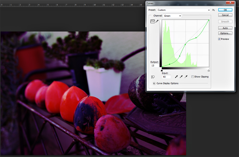
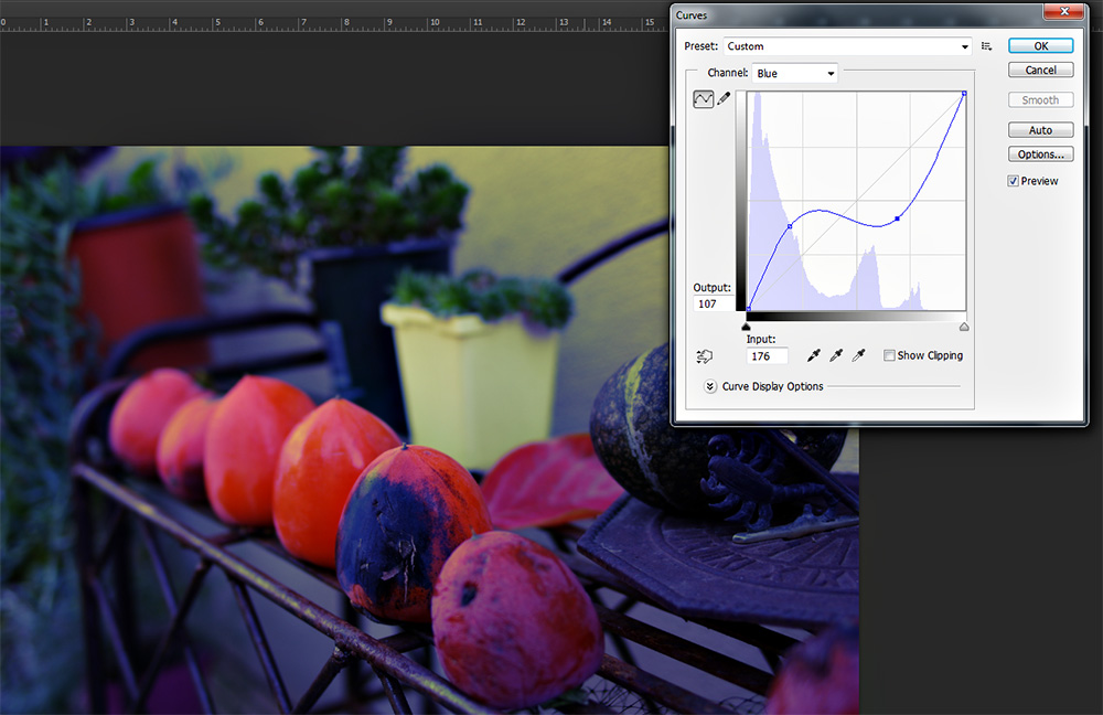
Here's how to read a curve: There exist three data points you need.
1- The colored area represents the amount of each color in that range. So for blue, the shaded area tells me I have a lot of blues (in the base image) that are in the darker ranges.
2- The diagonal gray line is the 'normal' color range for the image as it was when you opened the curves dialog. This is the line you move and manipulate to adjust curves, though the original gray lines remains as a reference point.
3- The curve line that shows the new balance against the existing conditions. Again with blue, the increased curve on the left means there will be more dark blues (at the cost of other colors) and the dipping curve on the right means that lighter blues will be replaced by their opposing colors (typically manifesting as yellow.) So if you move the left side of a curve line you can gain very fine control over precise color balance levels in the image.
6- Exposure
Go to menu item Images> Adjustments> Exposure.
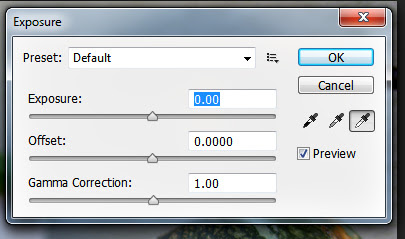
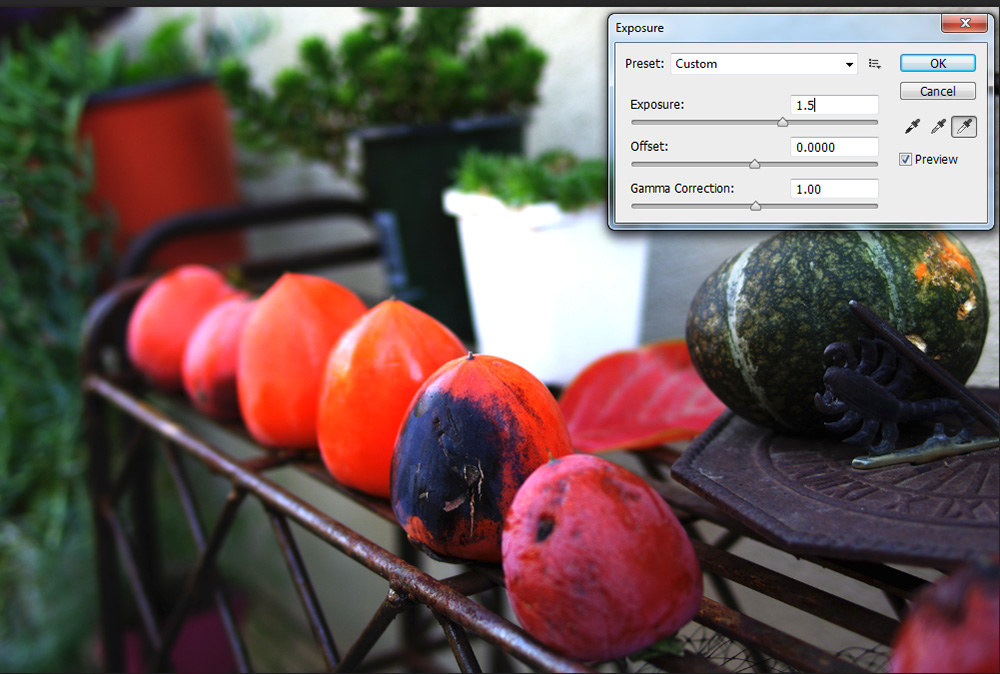
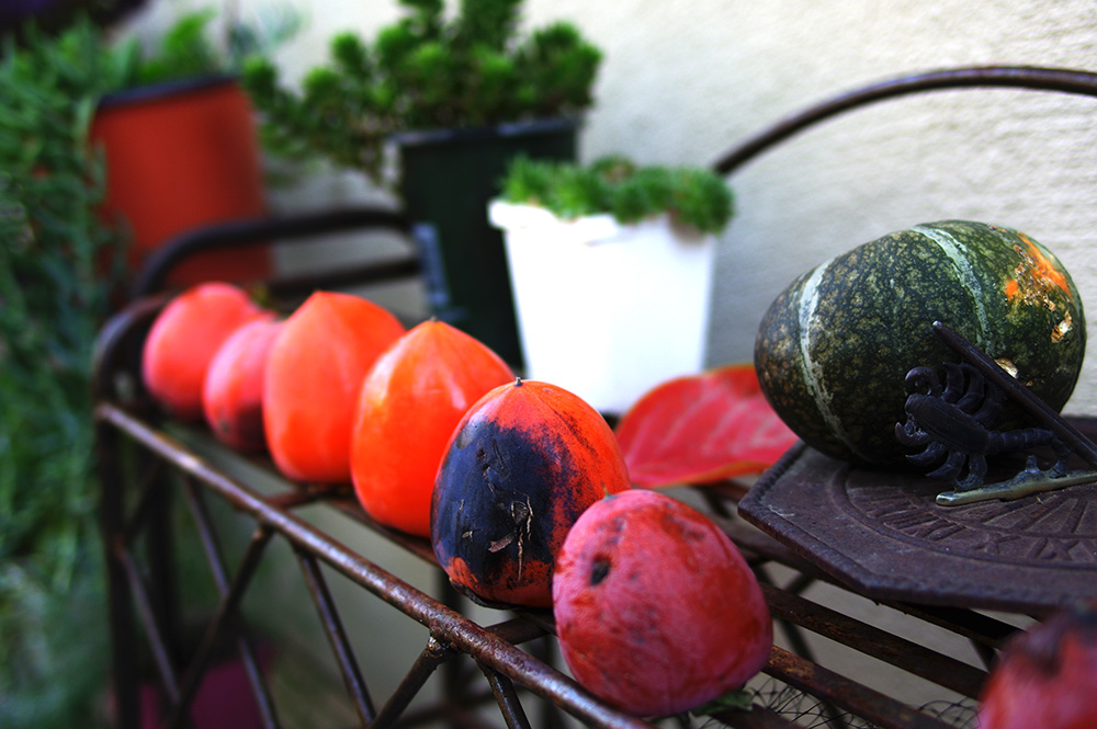
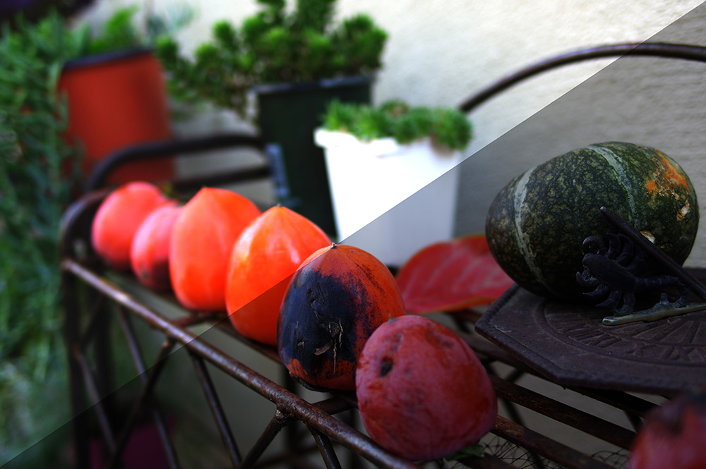
Using the exposure tool, you can correct small exposure errors. Here I've corrected upward 1.5 stops (the number you type into the exposure box is the number of stops in exposure the image will be corrected.) I typically don't recommend correcting more than a half to three-quarters of a stop. One stop, for some images, is okay. More than that and, as evidenced by the white pot in the background, highlights start to blow-out. Also, contrast increases and robs your image of interesting details. Here's a cross-cut sample for comparison:
So, in a nutshell, use this technique to correct minor exposure errors of less than a stop.
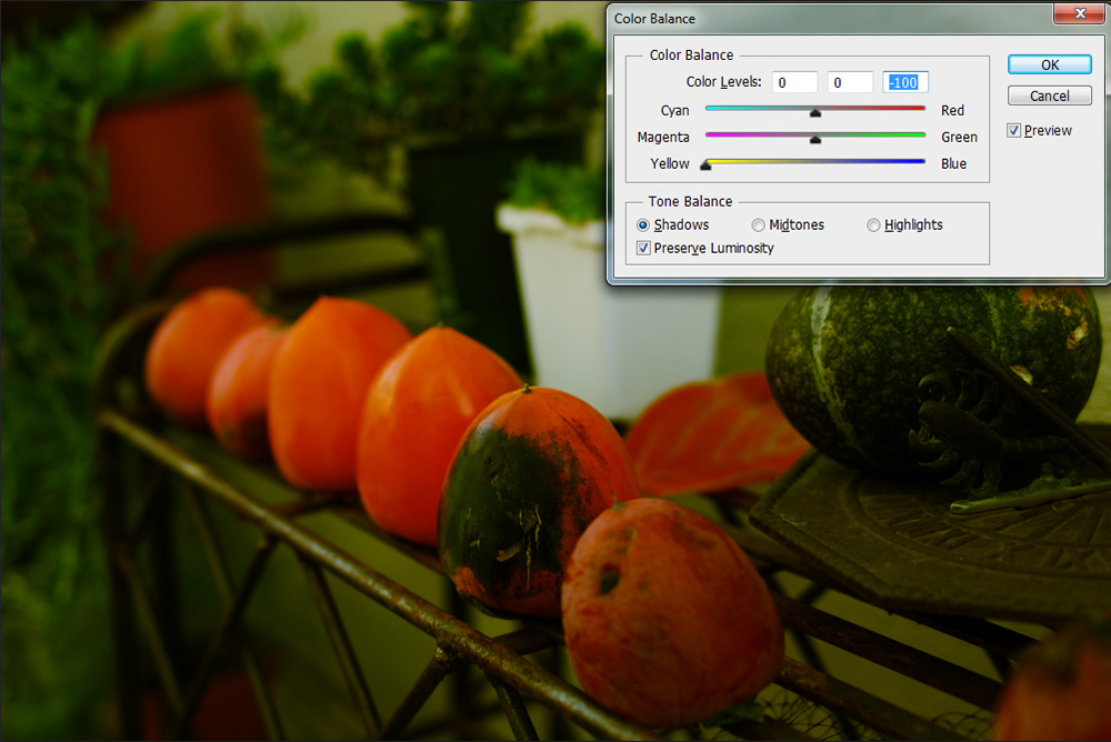
5- Color Balance
Go to menu item Images> Adjustments> Color Balance or hit CTRL+B.
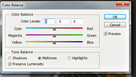
This dialog has three important elements. Firstly, make sure that the preview button is checked so you can see the effect your color shift has as you do it. Secondly, select whether you want to affect shadows, midtones, or highlights. The dialog defaults to midtones as that's typically the most useful. What I'll do here is how you how adjusting the same color in the same way affects shadows, midtones, and highlights.
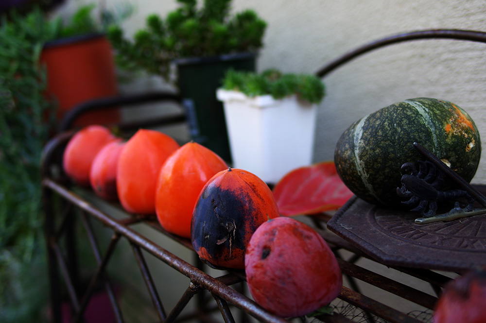
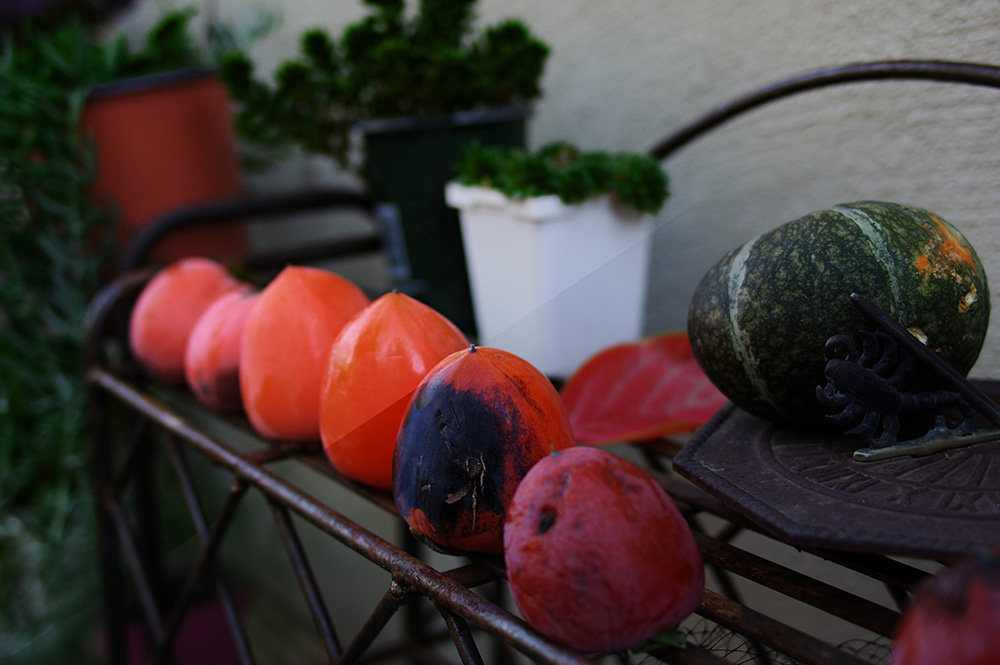
For reference, here is the original image:
Sliding the slider replaces the color on one side with the color on the other. So going from 0 to -100 replaces all the blue tones in the shadows with yellow. The software isn't actually evaluating your image for shadows and highlights. It's actually basing the effect on whether a blue is a dark or light shade.
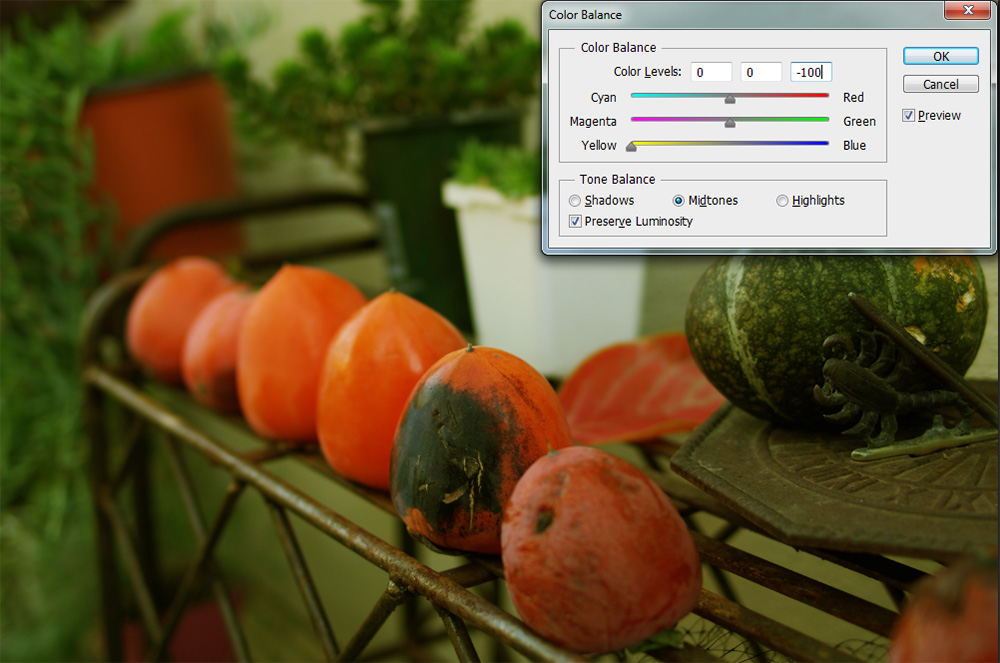
Here the same approach applied to midtones removes the midtone blues and replaces them with yellow.
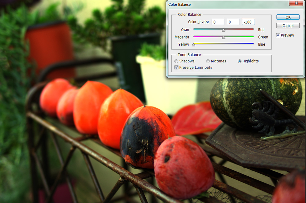
Because this image had very few blue tones in the highlights, the highlight adjustment has minimal effect. Were you to do the reverse, the image's blues would be amplified. Likewise, if you slid the magenta-green slider, magenta tones would replace greens or the reciprocal thereof.
This is a powerful tool, like curve, that requires a little less precision. If Curves is like painting a mural, this is more like finger painting by numbers.
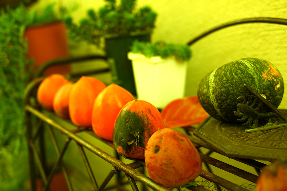
And if you jack all three sliders -- shadows, midtones, and highlights -- to one side, here is what you get:
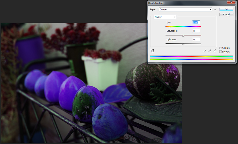
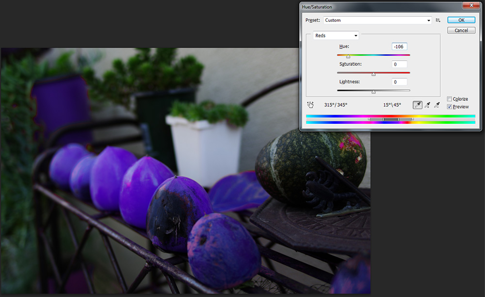
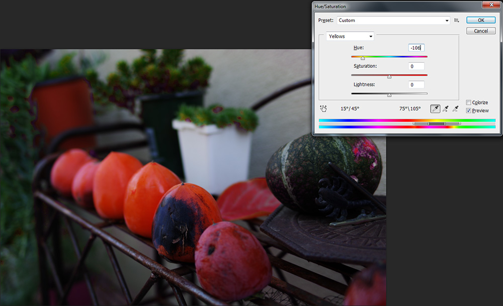
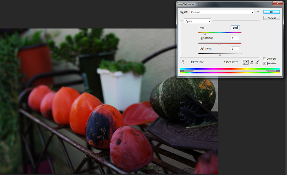
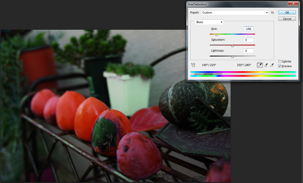
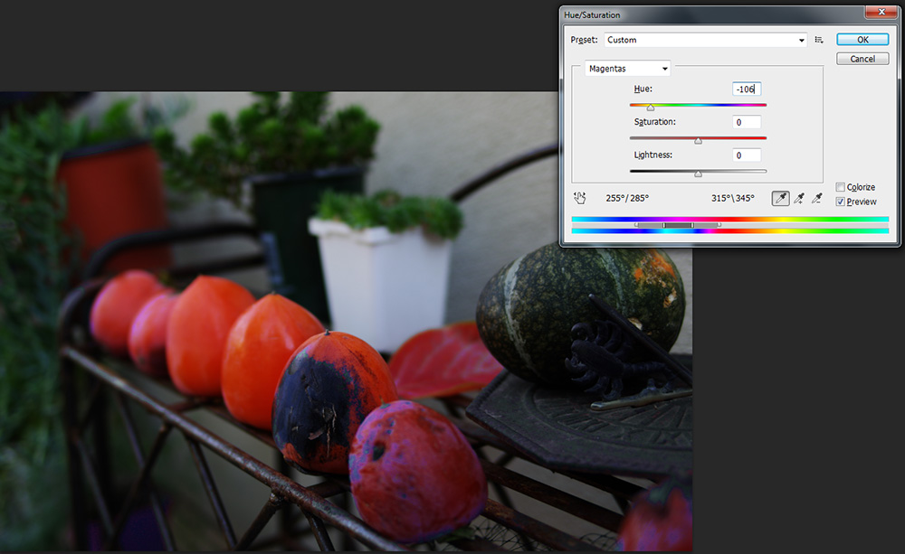
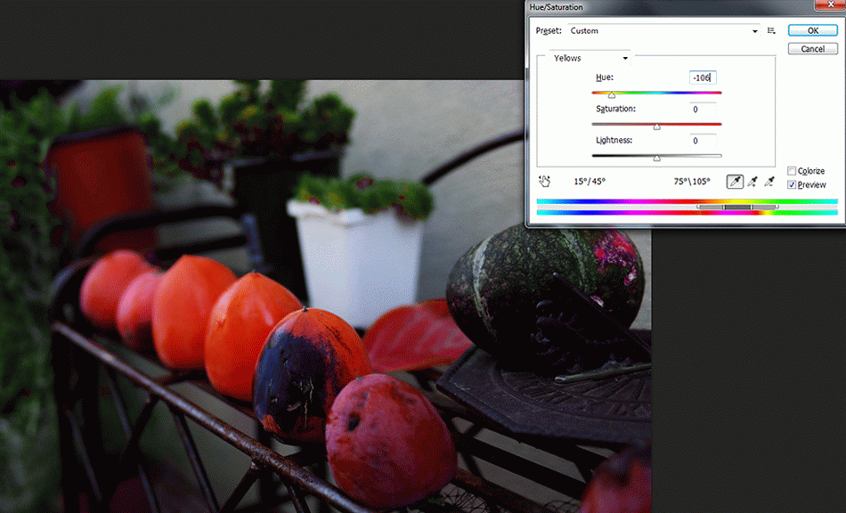
4- Hue and Saturation
Go to menu item Images> Adjustments> Color Balance or hit CTRL+U.
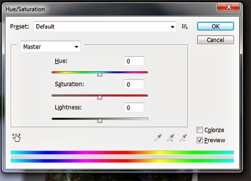
Underneath the drop-down are three sliders -- hue, saturation, and lightness. With these you can affect how colors display in images. Hue changes coloration -- blue can become red, green can become orange, and so forth. Saturation affects color intensity. Lightness simply the lightness. With saturation, it's a good idea not to go in the plus direction more than about 10 or 15. Going minus to the far left will give you a monochrome effect. You know those selective color images? This is one way to obtain the effect.

And a quick thank you to Google+'s Auto Awesome for this helpful animation:
This is a very useful technique and tool. If you need to make multiple similar images, for instance a car, but with variations in color, you can use this to change the subject's color while preserving shadow tones and other effects. The added benefit of this being that you don't need to buy a car in each color. The same applies for bed sheets, markers, and other objects.
This can also be used to correct an image's color to recapture tones and colors as you remember them. Film and digital sensors are not as adept at seeing colors ass we are. Also, they see colors as colors are. Our brains correct colors when we see them. The term for this is photometamerism.
3- Manual Black and White
Go to menu item Images> Adjustments> Black and White or hit CTRL+Alt+Shift+B.
Here's a video I made back when I was using Photoshop CS4. This shows the tool in action better than any image series.
That said, here are three possible ways that black and white can bee used on the image in this post.
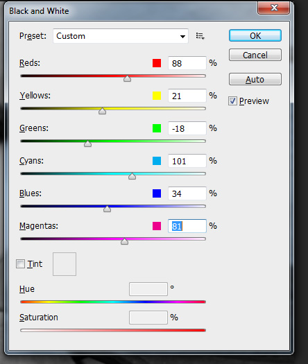
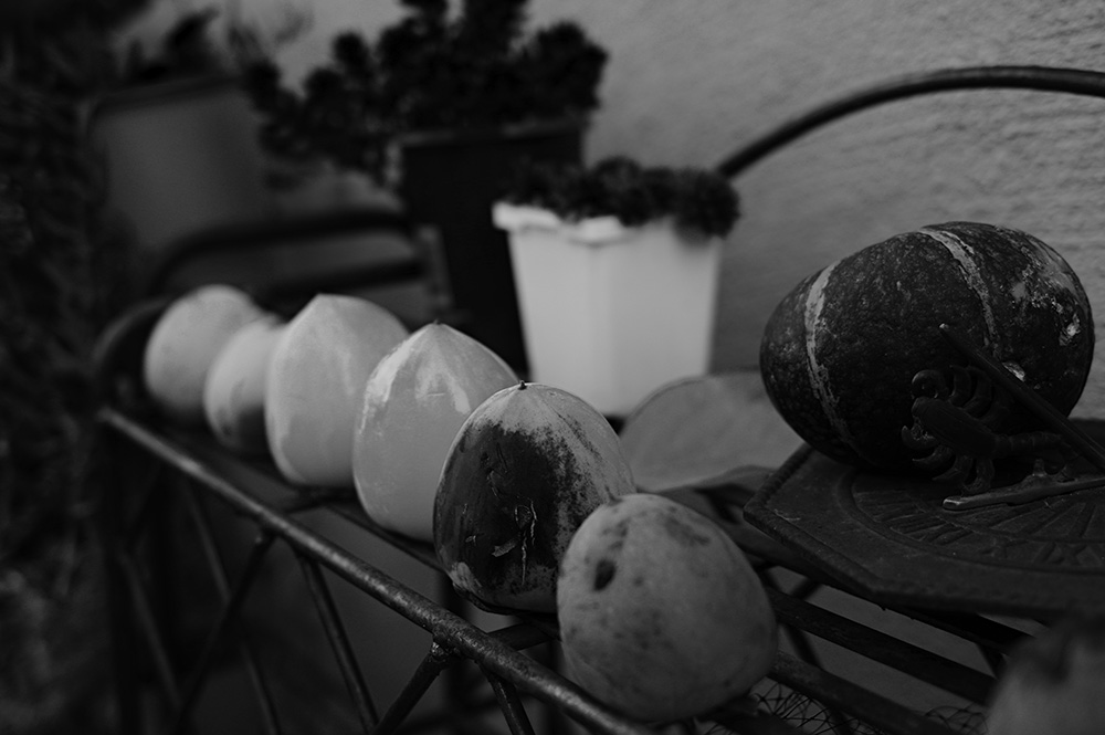
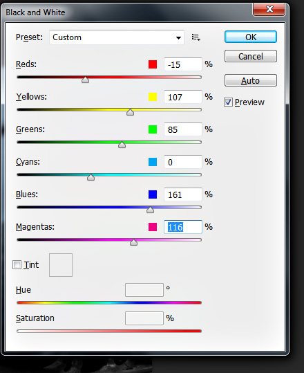
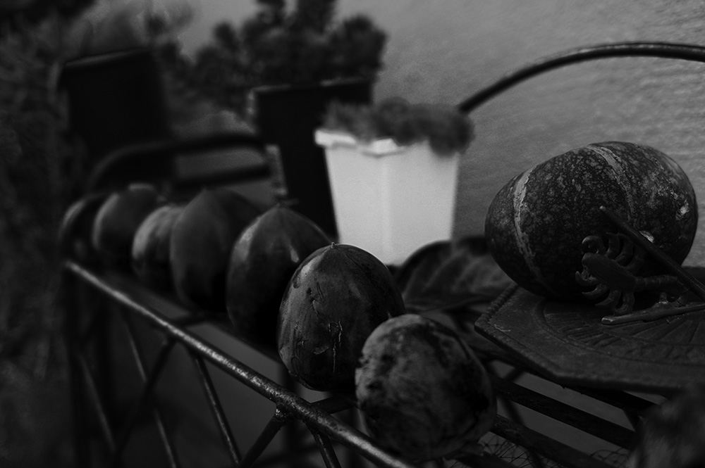
In short, this is a very powerful tool for creating black and white images.
2- Unsharp Mask
Go to Filter > Sharpen > Unsharp Mask
This tool should be the last thing that you do before saving an image. For digital images, this take a bit of the softness off, especially for images saved straight to .jpg format in the camera. Like all of these tools, though, the unsharp mask has a lot of potential for overuse. Here are a couple of samples from one of last month's blog posts:
Appropriately sharpened
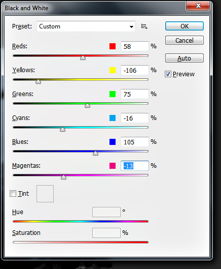
1- The Luminosity-Monochrome Color Pop
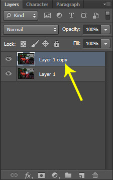
This is a trick I'm sure I didn't invent, though I haven't seen other people using it nor seen any mentions of it online. I like to use a simple two-layer set up to make colors pop more. To do that, open your image in Photoshop and hit CTRL+J. Now, you need to have your layers window open because we're going to make some changes.
Here, for reference, is the original image again.
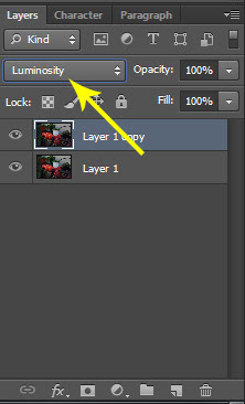
So now that you have the image opened and copied as a layer, let's manipulate the image. Change the layer's blending mode to luminosity. This will allow you to see what you're you're doing in the next steps.
Open up the Black and White tool (CTRL+ALT+SHIFT+B.) Now adjust the sliders.
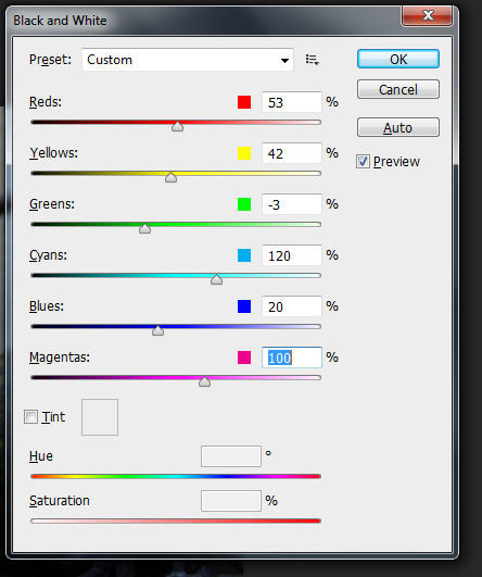
What happens as you do this is that you will make the tones in each channel lighter or darker. The luminosity blending causes each tone to be altered in color because the black and white layer's luminosity is being retained as well as the color layer's color.
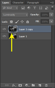
Here's what your layer panel will look like when you've made the luminous layer black and white.
Here's what your layer panel will look like when you've made the luminous layer black and white.
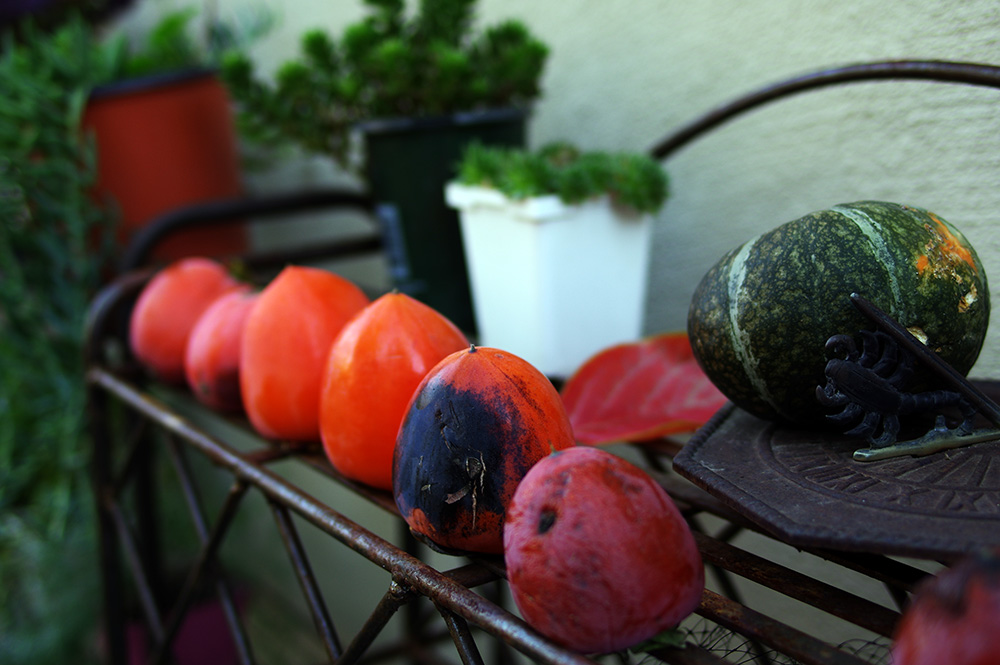
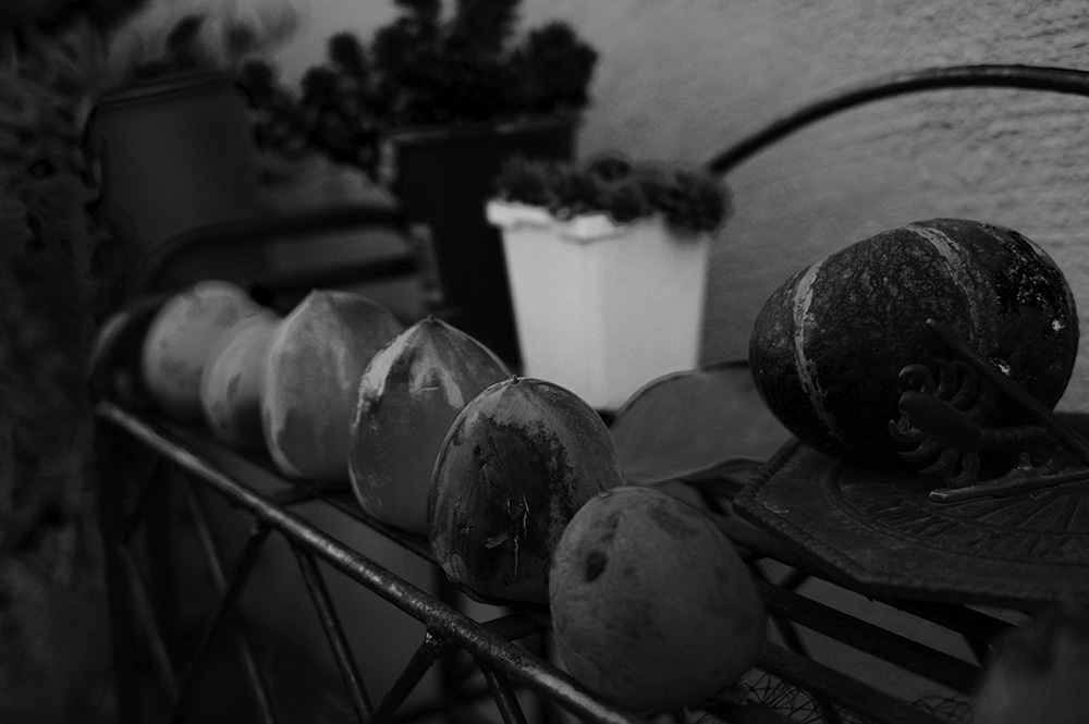
And here's the final image.
And a comparison with the original. You can see that, in general, the tones are kept though the image pops a bit more. The persimmons, the focal point, call out a bit more attention for the added luminosity.
And a comparison with the original. You can see that, in general, the tones are kept though the image pops a bit more. The persimmons, the focal point, call out a bit more attention for the added luminosity.
See you in a week for Ten Great Google+ Photographers (other than me) to Follow.
No comments:
Post a Comment