Ilford PANF 50 ISO is a particularly contrasty film suited for subtle lighting. Red filters dramatically increase contrast. So these photos result from an already-contrasty film paired with a highly effective red filter that substantially increases image contrast. Let's see some results.
1/125th, f4
1/125th, f4
1/500th, f1.8
1/125th, f4
1/60th, f11
1/250th, f4
1/125th, f2
A Year in Photos
Photography, fiction, and personal essays form my three primary creative outlets. For this blog's first 18 months, I used it primarily for photography. As I've returned to creative writing, I'll use this blog for fiction, too. Sometimes, when reality needs to be discussed more than truth, I write personal essays.
This blog will continue to showcase as many above-average photos as I can muster. Hopefully my written work will be as good or better than the visual. Whichever drew you here -- photographs or fiction, I hope you enjoy both.
Wednesday, February 29, 2012
Tuesday, February 28, 2012
Special Edition: Golden Gate Park
Last Wednesday I did not get to take a camera out, so fortoday's post I'll share what I had originally planned to save for this Saturday as a special post. Instead, you can see these photos today. As is normal for Saturdays, I don't track the lens and film combinations towards the goal of using a unique combination every day this year. Also, this trip had three films: Ilford PANF 50, Agfa 100, and TMax 400. The TMax is still in the camera and I'll finish it this weekend or sometime next week.
Trees at Sunset. Agfa film. The trees appear to be lit up because the sunset was casting them in red light. With a red filter, that light became lighter compared to the rest of the image. I expected this to be blurry as it was hand-held at about 1/15th or 1/8th of a second.
Urban waterfall, a creek at the National AIDS Memorial. When without a tripod, flat rocks will do nicely. Afga film.
Not entirely sure I care for the way the Agfa rendered these rocks. Maybe I should have used the red filter I brought that day, like I did with the other images above.
Another waterfall shot. Super contrasty. Agfa again.
Agfa, red filter, effectively making the forest seem even darker at dusk.
The one Ilford shot that turned out. I brought a roll marked "27" but it only had four exposures. This was shot resting on a fence on a four- or six-second exposure, f22. At 75mm, this may actually have been around f29 or f32. There were kids playing in front of the building, all effectively gone due to the long exposure.
Monday, February 27, 2012
How Filters Work: Part 2
Yesterday we examined how filters effect monochrome film. For today's entry, I set my Pentax K-7 on monochrome and shot the same series of photos. For reference, here again is the test chart used for these experiments.
The K-7 images, firstly, are much crisper than the RT's. The K-7 I focused manually using a manual-focus Sigma 35-80mm lens. This lens is VASTLY superior to the kit EF lens on the RT. Also, the K-7 has live view, allowing much more accurate focusing.
For each of these pairs, I'll first post the film copy from yesterday and then the K-7 copy. We'll then examine how they're different. First, no filter.
Firstly, you'll notice that in monochrome the K-7 sees red and magenta as the same. Green and blue it also sees the same, or close. Compare that to the Agfa film, which sees red and blue the same and cyan and magenta in similar fashion. This relates directly to how CCDs see light versus how film sees light. CCDs capture light in pixels. The pixels themselves do not see color, only shade. So each pixel has a red, breed, or blue filter over it. The amount of light penetrating the pixel tells the camera how dark or light the subject is. The pixel's color filter determines the color and the camera registers that. So a pixel with a red filter will always see a red dot. The variations between pixels determines the final image.
Another type of digital sensor, used by Sigma in their S1 for instance, has three layers of pixels. Light penetrates silica at different depths for each wavelength, so if light hits a pixel, then the pixel tells the camera what color to make the dot. Light penetrating all three would be white. Light penetrating only one would be, I believe, blue. This is close to how actual color film works and the samples I've seen show that this technology needs fewer megapixels to achieve superior resolution. Sigma, I believe, say that their S1 compares with competitor's camera of twice the megapixel resolution.
So, let's begin comparing how the K-7 sees monochrome differently than the Agfa film with various filters.
Here the K-7 shows the red and blue being the same basic tone while the magenta is now lighter than red. This is because magenta, having some blue ,was somewhat lightened by the blue filter cutting out red wavelengths. On film, this is somewhat more pronounced.
Green filter.
We see here, again, differences in the shades between colors on film versus digital. Digital again sees red and magenta the same and blue and green approximately the same. This tells us that the CCD sees blue and green as similar, perhaps identical, wavelenths in monochrome. This will be more well illustrated later when we use these images to create a color-separation recreation.
Orange Filter
This test shows us that the K-7 again sees red and magenta as the same with orange filtration. This is the same for both film and CCD. The notable differences are between the blue and green darkness, and the yellow's brightness. On the CCD, yellow becomes almost white. This is because the CCD cannot actually see yellow, whereas film can. Note that on the film image, there's a difference between the yellow and white. The CCD sees yellow as a combination of red and green. But the wavelength is close to orange. However, why the CCD lightens yellow mystifies me. I would have predicted the opposite since the filter should reduce, substantially, the amount of green and red light reading the sensor.
I'll skip the purple filter because it's not a contrast-enhancing filter. And it's silly.
Red filter
Now here we see some action. The red filter on the K-7 does exactly what its supposed to do -- darken blue and green. The Agfa film records blue and green as darker, but not as much. To understand why the red filter has such a profound effect on the CCD as compared to film, we need to understand a bit more about HOW the CCD works. Digital camera sensors, as noted above, are made of a checkerboard of red, green, and blue pixels. There are more green than red or blue and the sensors are calibrated to green light. Because of this, CCDs are more sensitive to a lack of green light than any other spectrum. As for blue being darkened, blue light is particularly darkened by red filtration and so all the blue pixels register less light, ergo are darker. Because film sees all light in different ways, it is less susceptible to prime-color filtration (in this case red) than is the CCD.
In the interest of time, I'll bypass the tobacco and yellow filters. The tobacco filter worked like a light-red filter, which makes sense because its probably just red and green mixed. The yellow had a minimal effect on the CCD, a more noticeable effect on the film. Again, this makes sense in light of the above explanation of how a CCD works. So let's end with an experiment in color separation printing.
Color photography predates color film substantially. By taking three images, one with each prime color photograph, a crafty photographer can make a color image. This works because when one filters red, the film registers near-white for red. When one filters blue, the film sees blue as near-white. A green filter makes green appear near-white. So, take a negative with a substantial near-white area of red, reverse that negative to make that area near-black, and then change the blacks to red and the negative displays the light present in the red spectrum. Repeat the process for blue and green and one can make an RGB print. In this case, I used the process to make an RGB negative. First, let's see how the original test chart looked again:
Now let's see how the color-separation recreation looks.
Bear in mind that this is based on a series of digital images and results from a process not truly suited for color separation work. Actual color-separation work requires specialty, high-contrast film that records in 'on', 'off', and very few or no shades in between. This recorded various gray shades, resulting in some differences in hues and tones. I had expected green to be the most faithfully recreated in this process, but surprisingly the result shows that the blue filtration was very effective on the CCD. Also, the red filtration worked... kind of.Maybe a darker red filter (this cheesy red filter is pretty light) would have had a different or better result. The yellow and tertiary colors were not as well reproduced as the prime colors, however.
Part of this imperfect result may be because the test chart was printed with a CMYK printer. But honestly, these results are better than I expected for demonstrating a concept.
Sunday, February 26, 2012
How Filters Work: Part 1
Monochrome photography benefits greatly from filtration. But filters present a problem, too, in that they can increase glare and reduce image quality. Low-end filters, made of plastic or plexiglass, especially reduce image quality. Basically, using cheap filters on a nice lens cripples its performance, like putting a quarterback in a cast. Good filters can be $50 or $75 for a basic ultraviolet filter. Polarizing filters, $200. That said, I don't have any super-nice lenses, nor am I sitting on any $200 filters. I do have a set of filters I bought on eBay for $15 from a seller in China. They are of such poor quality that the dye job on the blue filter is not even consistently dense. That said, the results below are not going to be as dramatic as could be achieved with good filters. Also, the results below are simply for illustration of basic function. That's why they're a fairly boring image repeated over and over.
Firstly, here is the test chart I used for these samples.
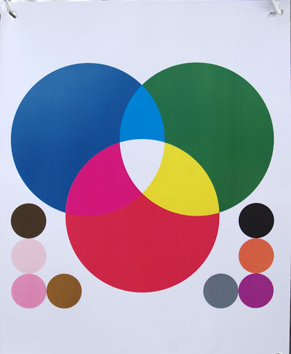
It's important to understand how this will look rendered monochrome.
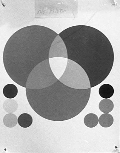
This was taken with Pro Max 100 ISO film. Now, had I known last week what I know today about Pro Max, I would have used something else. Pro Max, apparently, is rebranded Agfa. Agfa stopped making film in 2004, but apparently the company they used to make Agfa brand film still makes the same film for resale as generic brands.
All monochrome films see color. A monochrome film's ability to see color is called the spectral sensitivity. In fact, most films have spectral sensitivity charts posted online somewhere on the manufacturer's websites. Here is a link to a PDF for a film I'm fond of: Ilford PANF 50 ISO. The first page of this PDF has the chart you'll want to at least glance at before reading further.
So let's understand exactly what Ilford tells us here about their film:
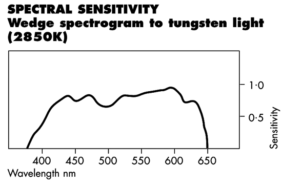
I've reproduced (without permission but also hopefully without hurt feelings) Ilford's chart. This chart does not tell the whole story and you should visit Ilford's website and use their guidance when you use this film. That said, the numbers along the bottom are light in wavelength. The levt side, up to about 320 nanometers (nm), is ultraviolet. That's light that we can't see, neither can this film. In fact, UV light can't really penetrate glass. So those UV filter, they provide no additional benefit for your images.
PANF 50 begins seeing light in the dark-blue and violet range. It sees light up to the reds, the 600nm range. Infrared, which humans can't see, begins with near-infrared light at about 680 or 700nm. So this film also cannot see infrared light. The peaks and valleys along the spectral sensitivity line tell you how much each color registers on the film. The higher the peak, the lighter more sensitive the film is to that color, the lighter it will appear on the film. So this curve tells us that if a field of light, from left to right, from 300nm to 800nm were projected at the film, that it would see from dark blue up to red. Further, this tells us that dark blue and dark red would be the darkest shades. Green (500nm) would be the darkest of the middle tones. Orange (600nm) would be the lightest. We see that because the height of the line on the chart correlates to how close to while the film will see a color.
Note that all films have different spectral sensitivities. That means that the same film camera can shoot the same scene a dozen times in a day, each with a different film, and get a dozen different results. Well, that's one advantage for film over digital -- a film camera is as versatile as the film inside it. A digital camera is bound by it's sensor's parameters.
So how this effect film when used with a filter is thus: A filter cannot add light, but it can block light. A red filter is not a red-adding filter, but an everything-but-red-cutting filter. That means a red filter allows red light through but blocks blue, green, purple, yellow, and orange in varying degrees. The amount of non-red light a red filter cuts depends on filter quality, tone, density, dye composition, and so forth. Lots of factors that are too specific for this general conceptual discussion of filters. For this post's purposes, understand that colored filters allow their color to reach the film but prevent other colors.
How does this affect monochrome photography, though. Looking at the spectral sensitivity chart above, adding a red filter would suppress all the wavelengths left of about 625nm. Therefore their curves would be pushed downward. On film, everything not red would appear darker. The further from red that color is, the darker it would appear. Blues would be near-black. Greens, dark charcoal. Yellows, darker gray. Orange, less effected but still darker. Reverse that and put a blue filter on, you'll have near-black rendition for reds, darker oranges, gray yellows, and less-effected greens and purples.
So let's see this in practice. Here again is the test chart without a filter.
You'll first notice that it appears to have greater contrast. It does. Notice next that the blue and green are much darker than without a filter. The red filter I used is more of a magenta-ish color, so it does not affect blue as greatly as it should. Comparing the two charts, you can see how the color tone is altered between the two images.
Here the blue filter has made the green darker and the cyan near-white. That's because this blue filter is particularly light colored (and generally poorly dyed.)
And here is a green filter test shot. You'll see a variation on a theme here. Also, these represent the three prime colors for light -- red, green, and blue. Other colors, obviously, compose the visual spectrum including yellow, orange, purple, and brown. The next images show the chart rendered through various non-prime colors.
Orange filter
'Tobacco' filter
This filter is actually an 'artistic' filter meant to give a quick and dirty sepia cast to color images. God only knows why it's on a rotating base. Man that makes it hard to get off a lens.
Yellow filter
Purple (FL-W) filter
This filter is actually used to correct color cast in fluorescent light. Basically, daylight color film can't be used in fluorescent light without casting everything in sickly green. Slap an FL-W (fluorescent white) filter on, and outdoor film can be used indoors. It's not really a color-correcting filter for monochrome photography.
So you can see, scrolling through the images above, that filters change how monochrome film sees colors. What does that mean in practical application, though.
For decades during early photography, the sky rendered white and only white on film. Cloud photography was impossible. Then came yellow, orange, and red filters which darkened blue hues in varying degrees. Red, of course, provided the most dramatic effect. This led to images with dark skies that fundamentally changed how photographers approached including the sky in their images.
Colored filters also allowed for early color photography though a process called color separation. We'll look at that tomorrow in Part 2 when we repeat this experiment with a DSLR. Do CCDs see color differently than film? We'll see.
So colored filters narrow the wavelength band reaching the film. By separating a real-life scene into the various wavelength bands, photographers captured the first color images and printers created the first colored prints. The process is not dissimilar from a color laser printer where a sheet of paper passes under four toner drums -- cyan, magenta, yellow, and black. Each drum prints only part of the image, leaving everything that is not the drum's color blank. Color separation photography and printing work the same way. Three photos taken with three filters -- red, green, and blue. Each negative is printed on the same paper with the corresponding color. In fact, tomorrow you'll see a color-separation recreation of the test chart above. If nothing else, it demonstrates how cruddy these filters are.
So with that demonstration, let's conclude for today by looking at what happens when we combine filters. Imagine, first the result. Light encounters a blue filter. Much of the non-blue light bounces away. Then it encounters a red filter, blocking again much of the non-red light. So greens and yellows ought to be dark black. Reds and blues ought to be the same basic tone. Let's see.
That is about what that looks like to me.
A green and a yellow filter
A blue and an orange filter
Firstly, here is the test chart I used for these samples.
It's important to understand how this will look rendered monochrome.
This was taken with Pro Max 100 ISO film. Now, had I known last week what I know today about Pro Max, I would have used something else. Pro Max, apparently, is rebranded Agfa. Agfa stopped making film in 2004, but apparently the company they used to make Agfa brand film still makes the same film for resale as generic brands.
All monochrome films see color. A monochrome film's ability to see color is called the spectral sensitivity. In fact, most films have spectral sensitivity charts posted online somewhere on the manufacturer's websites. Here is a link to a PDF for a film I'm fond of: Ilford PANF 50 ISO. The first page of this PDF has the chart you'll want to at least glance at before reading further.
So let's understand exactly what Ilford tells us here about their film:
I've reproduced (without permission but also hopefully without hurt feelings) Ilford's chart. This chart does not tell the whole story and you should visit Ilford's website and use their guidance when you use this film. That said, the numbers along the bottom are light in wavelength. The levt side, up to about 320 nanometers (nm), is ultraviolet. That's light that we can't see, neither can this film. In fact, UV light can't really penetrate glass. So those UV filter, they provide no additional benefit for your images.
PANF 50 begins seeing light in the dark-blue and violet range. It sees light up to the reds, the 600nm range. Infrared, which humans can't see, begins with near-infrared light at about 680 or 700nm. So this film also cannot see infrared light. The peaks and valleys along the spectral sensitivity line tell you how much each color registers on the film. The higher the peak, the lighter more sensitive the film is to that color, the lighter it will appear on the film. So this curve tells us that if a field of light, from left to right, from 300nm to 800nm were projected at the film, that it would see from dark blue up to red. Further, this tells us that dark blue and dark red would be the darkest shades. Green (500nm) would be the darkest of the middle tones. Orange (600nm) would be the lightest. We see that because the height of the line on the chart correlates to how close to while the film will see a color.
Note that all films have different spectral sensitivities. That means that the same film camera can shoot the same scene a dozen times in a day, each with a different film, and get a dozen different results. Well, that's one advantage for film over digital -- a film camera is as versatile as the film inside it. A digital camera is bound by it's sensor's parameters.
So how this effect film when used with a filter is thus: A filter cannot add light, but it can block light. A red filter is not a red-adding filter, but an everything-but-red-cutting filter. That means a red filter allows red light through but blocks blue, green, purple, yellow, and orange in varying degrees. The amount of non-red light a red filter cuts depends on filter quality, tone, density, dye composition, and so forth. Lots of factors that are too specific for this general conceptual discussion of filters. For this post's purposes, understand that colored filters allow their color to reach the film but prevent other colors.
How does this affect monochrome photography, though. Looking at the spectral sensitivity chart above, adding a red filter would suppress all the wavelengths left of about 625nm. Therefore their curves would be pushed downward. On film, everything not red would appear darker. The further from red that color is, the darker it would appear. Blues would be near-black. Greens, dark charcoal. Yellows, darker gray. Orange, less effected but still darker. Reverse that and put a blue filter on, you'll have near-black rendition for reds, darker oranges, gray yellows, and less-effected greens and purples.
So let's see this in practice. Here again is the test chart without a filter.
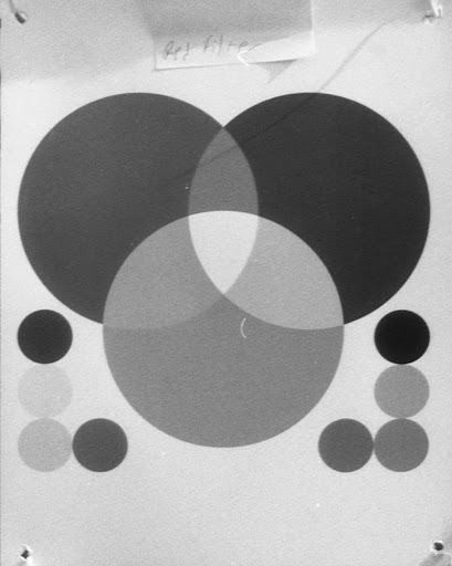
You'll first notice that it appears to have greater contrast. It does. Notice next that the blue and green are much darker than without a filter. The red filter I used is more of a magenta-ish color, so it does not affect blue as greatly as it should. Comparing the two charts, you can see how the color tone is altered between the two images.
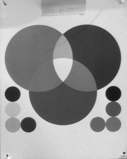
Here the blue filter has made the green darker and the cyan near-white. That's because this blue filter is particularly light colored (and generally poorly dyed.)
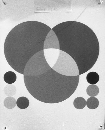
And here is a green filter test shot. You'll see a variation on a theme here. Also, these represent the three prime colors for light -- red, green, and blue. Other colors, obviously, compose the visual spectrum including yellow, orange, purple, and brown. The next images show the chart rendered through various non-prime colors.
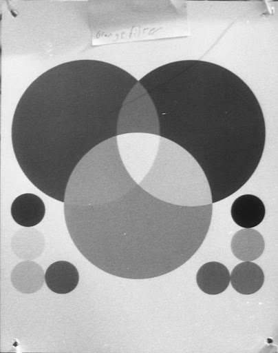
Orange filter
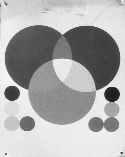
'Tobacco' filter
This filter is actually an 'artistic' filter meant to give a quick and dirty sepia cast to color images. God only knows why it's on a rotating base. Man that makes it hard to get off a lens.
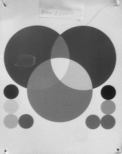
Yellow filter
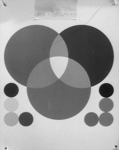
Purple (FL-W) filter
This filter is actually used to correct color cast in fluorescent light. Basically, daylight color film can't be used in fluorescent light without casting everything in sickly green. Slap an FL-W (fluorescent white) filter on, and outdoor film can be used indoors. It's not really a color-correcting filter for monochrome photography.
So you can see, scrolling through the images above, that filters change how monochrome film sees colors. What does that mean in practical application, though.
For decades during early photography, the sky rendered white and only white on film. Cloud photography was impossible. Then came yellow, orange, and red filters which darkened blue hues in varying degrees. Red, of course, provided the most dramatic effect. This led to images with dark skies that fundamentally changed how photographers approached including the sky in their images.
Colored filters also allowed for early color photography though a process called color separation. We'll look at that tomorrow in Part 2 when we repeat this experiment with a DSLR. Do CCDs see color differently than film? We'll see.
So colored filters narrow the wavelength band reaching the film. By separating a real-life scene into the various wavelength bands, photographers captured the first color images and printers created the first colored prints. The process is not dissimilar from a color laser printer where a sheet of paper passes under four toner drums -- cyan, magenta, yellow, and black. Each drum prints only part of the image, leaving everything that is not the drum's color blank. Color separation photography and printing work the same way. Three photos taken with three filters -- red, green, and blue. Each negative is printed on the same paper with the corresponding color. In fact, tomorrow you'll see a color-separation recreation of the test chart above. If nothing else, it demonstrates how cruddy these filters are.
So with that demonstration, let's conclude for today by looking at what happens when we combine filters. Imagine, first the result. Light encounters a blue filter. Much of the non-blue light bounces away. Then it encounters a red filter, blocking again much of the non-red light. So greens and yellows ought to be dark black. Reds and blues ought to be the same basic tone. Let's see.
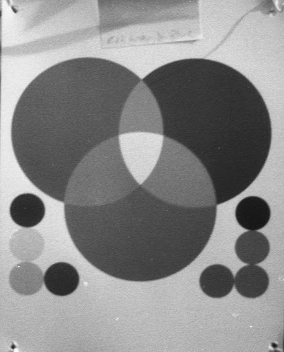
That is about what that looks like to me.
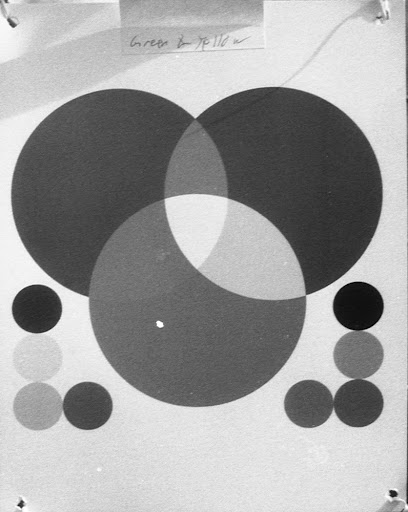
A green and a yellow filter
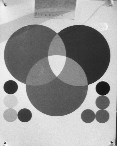
A blue and an orange filter
A Year In Photos -- Week Nine
I have five posts for you this week, but only three are from the intended lineup last week. Due to some intense deadline pressure, Tuesday and Wednesday I didn't get out for photographing whatever looked like it may be interesting. So, on Tuesday we'll complete a two-day look at how filters effect monochrome photography. On Wednesday, I have some shots from Golden Gate Park to share.
This week's lineup promises to be pretty great. We'll start the week with last week's Tuesday offering.
Monday: Nikon N70 (2314287), Nikon 35-80 (4438066), loaded with Tmax 400 ISO and a Nikkor Y48 filter to enhance contrast.
Tuesday: Pentax KM (8273837), Pentax-A 28-80 (6094417), loaded with Ilford 50 ISO and a UV filter. I'm still excited to see how this lens functions on film.
Wednesday: Canon EOS Rebel 2000 (2617067) and Canon 28-80(2611388)loaded with Foma 100 ISO film. I picked this camera up but don't have a huge need for it (since I have an RT, too.) So you can buy this exact camera on Amazon from me, if you'd like. It should be the cheapest one there. However, it won't ship till Thursday. This camera does have no nice characteristics. For instance, it's lighter than a burglar's footsteps and pre-winds the film. The latter allows it to wind film INTO the camera as it takes exposures. That's would have been useful this weekend when I loaded a roll of Ilford 50 ISO PANF into my F3. IT was labeled "27 exposures" but only had seven. Oops. I guess I mis-counted when I spooled that roll.
Thursday: Last week I picked up a lot of four 'broken' cameras. I suspected, based on the seller's descriptions, that two would work perfectly with fresh batteries. I was right. So ThHursday I'll try one of the camera out, a Pentax SF10 (4917010) and outfit it with my Pentax 35-80 AF lens (4447161) and a polarizing filter. For film: Foma 400 ISO. A great thing about this lens, at 80mm, it stops down to f32 (f22 at 35mm), so if Thursday is particularly sunny and I need to stop down to accommodate the 400 ISO film, I can.
Friday: Pentax K2 (7084574), Pentax 50mm (3007577), Ilford PANF 50 ISO, and a Tiffen 25 Red 1 filter. Interesting lens fact: This was the first lens I ever owned. Also, I have three copied of it. This one, unlike the other two, has an interesting bokeh when wide-open. Bokeh is the shape that blurry parts of a photography take. An idea bokeh is creamy, unobtrusive. This lens has a swirling effect when shot at f2 when the subject is separated from the background and there's a uniform distance from the subject to background. My other copies don't exhibit this effect, insofar as I know. I suspect it may be due to when they were manufactured. This copy's SN, 3007577, indicates it's the oldest (probably) copy. My other copies are 3165867 and 5207002. These are great little lenses and you'll hopefully see many shots from the three of them in coming weeks.
So, without further delay, let's see what you can expect for this week:
Street dance performance, Market Street.
National AIDS Memorial, Golden Gate Park.
Thursday, February 23, 2012
Special Edition: Ektar Lomography
A while back I picked up 15 rolls of Photoworks 400 ISO for crossprocessing experiments this year. The seller kicked in five rolls of Ektar that I didn't expect. So I was pleased and gave him all five stars. I've used three of the Ektar rolls, a 200 and two of the four 400s. The 200 was shot and returned one image that, when converted to monocrhome, wasn't terrible. The 400s have returned some very lomographic images that I've been pleased with. One roll was taken with one of my K2s the other with my F3. No idea which photos came off which rolls.
If you've never explored lomography, it's worth performing a Google image search to look at some results. Characterized by 'technically inferior' results, lomographic-type images are a modern film art form of the highest caliber. Let me pause here to note that Lomography (majuscule case) is a trademarked name belonging to Austrian company Lomographische, AG. The term lomography (diminutive case) is used by many photographers to represent lo-fi photography. I don't, personally, agree with calling lo-fi photography lomography for the same reason that I don't call photocopies Xeroxes and Internet searches Google searches: companies spend a substantial amount of time and money establishing and nurturing a brand. Brand degradation through common parlance denigrates the hours and ingenuity spent by marketing types to develop and coddle their brands. So, henceforth, I will refer to lo-fi photograph by its proper name: lo-fi.
Anyway, so these lo-fi results were generated by using Kodak Ektar 400 slide film that expired in 1983. The storage is, at best, questionable (probably a drawer somewhere.) Slide film degrades as soon as it is warmer than about 35 or 40 degrees (Fahrenheit.) SO this film returned very lo-fi results with poor color rendition, excessive grain, and a distinctly 1950-ish look. Also, I have no idea how these images arrived at this final look, except that the old film played a huge roll. Expired film is pretty cheap on a well known online auction site. Pick up a couple rolls and give it a shot. Any major city, and in fact some minor cities, will have a place that develops slide film. If not, any of a number of online sites can develop your film. I have used and like greatly OldSchoolPhotoLab.com.
Hannah is a fairly rare black Rhodesian Ridgeback. They're about one in 400. Her sister is also black, but her sister's ridge swirls in the other direction.
Hannah is silently judging me for taking her photo. She really, really hates having her picture taken.
I live a parking lot away from a fairly good pizza place. Cheever always perks up when we're outside and someone's ordered sausage or bacon on their pizza.
This is one of Cheever's classic looks: The 'yeah I just nailed that catch with an in-air inversion" look. He takes his fetch very seriously.
Wednesday, February 22, 2012
F3 Delivers Again
My Nikon F3 has become one of the three most important cameras in my collection, behind my K1000 -- the first SLR I ever owned -- and my Pentax K-7. In fact, I like my F3 so much that I've decided to get a second DSLR this year, a Nikon D5100 or D300 (The jury is still out on whether I want to use my NAI lenses on a DSLR.) That said, the F# does have one small issue -- the LCD in the viewfinder is dead so I never know what shutter speed I'm shooting, just the aperture. This was also my first outing with Efke 35mm film. Currently, my favorite film lineup goes a bit like this in 35mm:
1- Efke 100 ISO
2- Pan-x 125 ISO
3- TMax 400 ISO
4- Everything else.
That will change as I use different films. For instance, I want to use Adox in 35mm as well as Fuji Acros. And I suspect that with the right conditions Ilford 50 ISO would be a very enjoyable film to shoot. As for today's photos, I hope that you'll be plenty pleased. This roll returned some of the best results I've gotten this year. The F3 tends to do that.
f3.5. A long exposure, though. It was somewhat overcast at the beginning of my walk, and drizzly.
f11. A fountain in a courtyard area.
f22. I wonder what the heck that is.
f11. Well that helps a little. Actually, no it doesn't. I was just lying there.
f5.6 Oh, of course. Those were interior shots of the sculpture Icoaspirale. Why didn't I guess that the first time?
This sculpture falls soundly into the "I don't get it, but I really like it" category. Were the inside inaccessible, it would be a much different piece and much weaker for it.
f8. A seagull searching for french fries.
f11. Another seagull searching for french fries. Seagulls, I may have mentioned before, are disease bags. But they're okay in my book because they like fries.
f16. Let's just appreciate this image a moment. It's not going to win any prizes, nor will anyone ever hang it on a gallery wall. But it conveys the Efke film's quality in a clear, and appreciable way. When I upload images to my holding pen in Picasa, I shrink them to 1000 pixels wide by about 630 tall (depending on the image.) As a baseline, the longest dimension is 1000 pixels. This makes the images between .6 and .8 megapixels. I also compress them to 10, which makes them all about 150KB. Posted on this page, they're further reduced to 550 pixels wide. All that resizing and downgrading and this image has not gained grain or noise, lost meaningful image quality, nor developed strange jpeg artifacts. A lot of the credit rests with the film, and you can see from the water and the first boats that this film records great detail. In addition, the tonal range here is in balance in a way that would make histogram peepers drool. This film is an amazing film. If you ever shoot film, buy one roll of this and try it. This was $6 for 36 exposures. I actually got 28 on the roll. With the right camera, you may get 39 or 40. An amazing number of photos and only $6 for the roll, or so. Just a superb film. I hope it never goes out of production.
Subscribe to:
Posts (Atom)