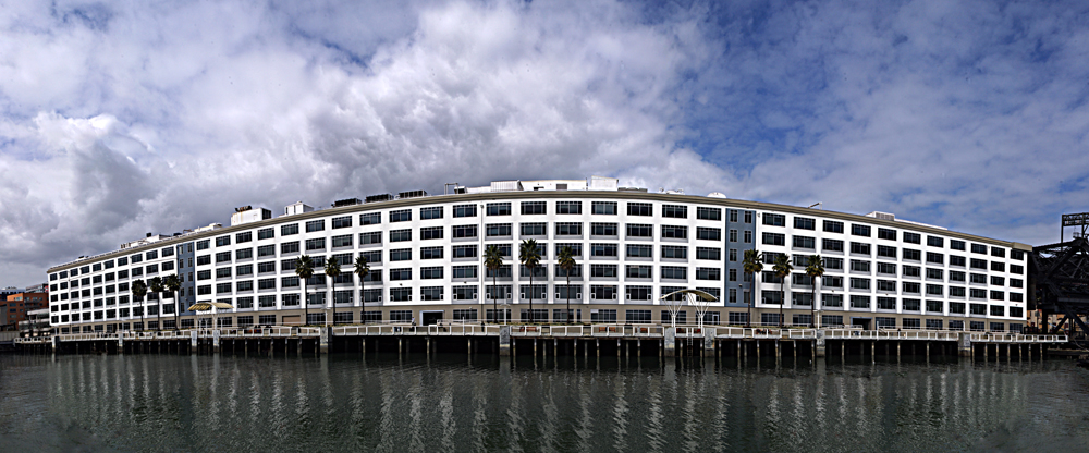
I'm not displeased with that photo. It's wildly exaggerated from real life, but I don't find it visually offensive. And the boomerang effect is fairly dramatic. SO first let's ask how this photo came to have this look. The building photographed is here, as seen on Google Maps.. The building is an entire city block long -- along Mission Creek from 3rd to 4th Streets. That answers the question about the boomerang look -- the perspective. Since this building is -- give or take 20 feet -- about 821 feet long, the distance from the building's 'front' is much different than from the wings. Specifically, from the focal center, the building was 261.4 feet from where I took the photo. The right edge was 372.9 feet, the left edge 545.5 feet. You'll notice, now if not already, that I was not centered on the building. That was because of a bum smoking crack where I could have stood to be centered on the building. I decided to let him smoke up in peace.
The lens was my Sigma 35-80mm. On the K-7's APS-C crop sensor, that means the lens, at 35mm, which this shot was taken at, acts as a 52.5mm lens. Clearly there's no way to take this shot from 261 feet out with a 53mm lens. One of the wonderful tools for photographs in the past few years has been Photoshop. A great feature is the photomerge function which takes multiple images, evaluates the content, and glues them into a single image. This was assembled from 39 images -- 3 horizontal rows of 13. The original merged image was 11,000 pixels wide (12 ft., 8 inches at 100%) and has much more of Mission Creek at the bottom. I elected to crop out the water since it detracted from the building composition.
I left my computer to glue the photos together and then balanced the color with automatic color balancing. This helps remove color mismatches between different stitched imaged. It's not perfect sometimes, but did well here. To make the image a bit poppier, I used the unsharp mask sharpening tool (though I don't recall the settings) and that improved contrast and added great detail depth to the clouds. In sum, the process took about 35 minutes, but I was able to do the photomerging in the background.

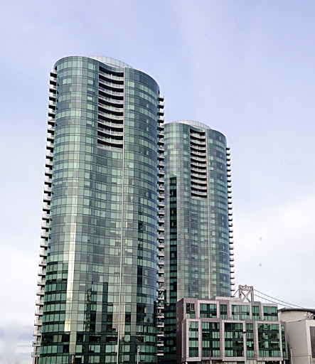
The Infinity Complex. I've photographed this before for this blog but wanted to come back on a sunny day. It's a great looking building designed by Arquitectonica and built by Webcor Builders. You can find it here on Google Maps..
This was created with the same process as above -- photomerging about 44 images to create a basic composition. This is the corrected and cropped image. One difficulty in photographing skyscrapers is that they always appear to recede in image. The lines look parallel in real life because our brain corrects for the perspective. Photographs can't do that, so Photoshop has to. With the Lens Distort filter, I keystoned the image to the maximum amount. THis had only about 25% effect on the image area, however, because whenever I correct lens distortions I increase the canvas size. This allows me to make corrections with no risk of image space loss.
So Photoshop took the merged, flattened, and cropped image and changed the rectangular shape to a keystone shape. A minor crop and the image was close to none. However, I wanted the smaller building on the right to be the vertical and horizontal basis, and it was, but that meant the tower was still leaning far to the right over the building do to perspective and viewing angle.
To correct this, I used the shear filter and made a custom shear shape for the image to follow. Now, it's not perfect -- not even close. The tower has a minor leftward bend near the top. This resulted from the image shear exacerbating the perspective and viewing angle issues. The entire process took about the hours.
Of the two, I'm more partial to the first because to my eye it's a better finished product. Also, the setting strikes me as more dynamic. And it required MUCH less processing. SO here are some lessons learned:
1- Good shots are achieved in-camera and require minimal post-processing.
2- Photos requiring extensive post-processing to become good or usable shots indicate that the shot could have been accomplished with greater quality in-camera.
3- Photoshop can make good photos great, but cannot make bad photos anything.
No comments:
Post a Comment